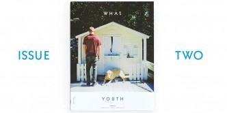
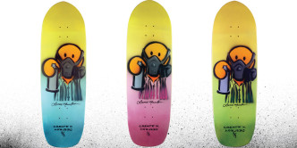
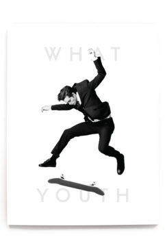
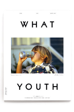
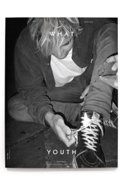
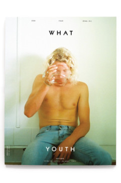
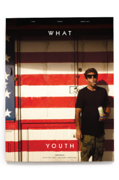
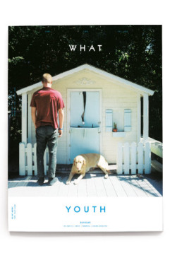
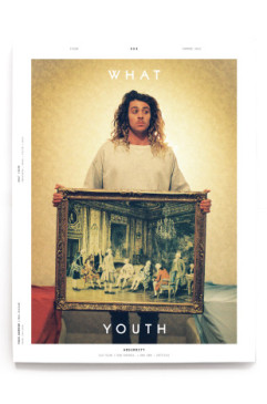
If you have Issue Two of What Youth Quarterly then you’ve already read about our skateboard collab with Lance Mountain. If you don’t have Issue Two, you’re reading about the collab now. (Also, damn, check yourself.)
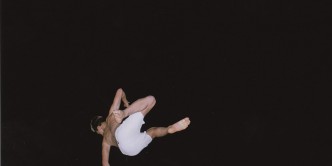
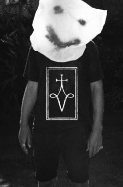
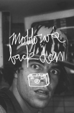
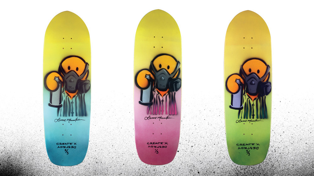
Lance designed the graphic above — inspired by an Arto Saari portrait, second slide, from Issue Two — for this collection of hand-painted skateboard decks. They go on sale this Friday exclusively in the What Youth shop. There are three numbered boards available — three, as in fewer than five or four. Click fast on Black Friday to make one of them yours. Special thanks to Create X Destroy for making this project happen.
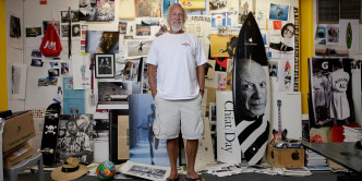
We spoke with Lance about skateboard graphics through the years and about his own art, beginning when his skate career did over three decades back:
Lance Mountain: At 10, I started skateboarding, and of course I wanted to buy boards. Couldn’t afford them, so I started making boards. Wanted an Alva shirt, couldn’t afford one, so I made an Alva shirt.
Obviously the influences from Wes Humpston and the Dogtown art, Craig Stecyk and some of the early imagery from skateboarding — those were my influences. Without knowing it, skate graphics were probably influenced by Rick Griffin, his style, so I didn’t know I was influenced by that, but…that was the background of it all. Making your own stuff, making your own product.
Even before I got full on sponsored, I rode for a park team. Started riding for a skatepark team, because that’s sort of how most of us got introduced into professional skateboarding. Our park was John Lucero, Neil Blender and myself — and others — and that was kind of the park that the creative weirdos came from. Marina was more like the attitudes, Upland was more like, “We’re bigger and badder than all you guys,” Del Mar was more progression. Lakewood was in between. And we were the artistic dudes.
Neil was our leader. Very creative dude. So he was constantly, all of us were constantly drawing stuff. We made our own magazine for the park, I started shooting photos and laying out ads for them, and slowly but surely started doing fliers and graphics and little things for that park. And that turned into drawing concepts and graphics for our own boards. Neil was the first really to do his own graphic — Wes Humpston obviously did his own graphic, but in 1980, ’82, ’83, at that point it became…the graphics were clean and rad, you know?
And Neil was really the first to do his own. He drew some ideas for my first graphic, and I drew some ideas. And I drew an idea for Rick De Montrond — “Spidey” — and the Santa Cruz artist re-drew it, and I did one for Ben Schroeder. So some of that stuff started appearing here and there, kind of teaching me how the graphic art world worked.
I didn’t draw any of my own graphics as product until ’89. It wasn’t something that I wanted to do. I really enjoyed the graphics that other people were doing. But at that point skateboarding was going through a phase where things started getting more personal.
I took a drawing my son did and started developing my style off of that, and from there I ended up doing all my graphics. It just kind of happened — it just went there, without trying to go there. I had other people asking me to draw stuff for them. In 1983 I had that Suicidal Tendencies graphic for Glen Friedman…it was just, skateboarding at the time was just very do-it-yourself.
It goes through phases. The ‘70s were very much logos, company logos. And then they started putting signatures of the guys on, and they became “signature” boards, when they found out that a guy and his popularity might sell a brand. And then from there it became very, a graphic that’s recognizable to one guy, and he kept that graphic for a long time, and you knew who that was. But there was a time when a lot of guys did a very minimal, very personal style, and that’s kind of the window where we were doing it.
And then I think the market got to a point where it was like, “OK, our art director’s very recognizable, we’re in a real market here, we’ve got to stay identifiable to people. Keep the same logo, keep the same look.” But there was a while where it was just all over the place, with all the art being drawn, and at that point I believe a lot of artists came into their own. When we were doing it we were in a sort of collapsed market because…you can’t pay an artist $5,000 if you’re selling 100 boards, you know? So it just became very personalized.
Come back Friday for a chance at one of the three limited-edition What Youth x Lance Mountain collab skateboard decks, and see more of Lance’s artwork on his website.






 NXT
NXT 


