
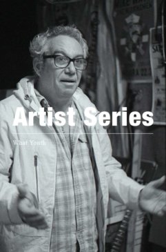

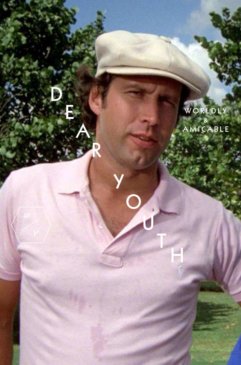


David Carson is a graphic design guru. His first book, with Lewis Blackwell, The End of Print, is the top-selling graphic design book of all time. Newsweek wrote that he “changed the public face of graphic design.” London-based Creative Review called him “the most famous graphic designer on the planet.”
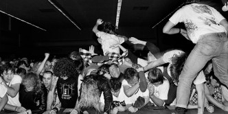
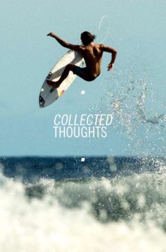
I first encountered his work in Beach Culture, a surf/skate/music magazine launched in ‘89. He designed only six issues before it folded, but his work there won him more than 150 design awards. He came of age during the ‘90s grunge era. What Nirvana and Soundgarden and Mudhoney were doing in music, Carson did on the page.
His most groundbreaking work came while he was the art director of Ray Gun, an experimental graphic design journal disguised as a music magazine. I grew up on Dr. Seuss books, and in Dr. Seuss, if a car swerves down the road, so did the type. Carson did this, albeit on a sophisticated, conceptual level. It was both wildly imaginative and screamingly obvious. A piece about blind surfers was portrayed simply with a full-bleed black spread. An interview with a band that had the habit of interrupting each other was presented with overlapping, cacophonous, virtually illegible text.
I met Carson in 2001 when he designed Big Surf, a NY-spawned single-issue magazine of which I was the editor. His Flatiron District studio was a mess. Never in my life had I seen so many icons on a single computer screen. He seemed to be juggling fifty jobs. I was concerned about our deadline, the precious art sent by contributors that was scattered haphazardly about his floor, whether he even cared. We were a couple months late with the issue, but it ended up winning design awards, and is still talked about today.
Carson has a giant respect for the random, the unexpected, the elevenenth-hour reshuffle. Which is to say that if a cup of coffee were to accidentally spill across a page he was designing, he would likely regard it as serendipitous, and find a way to make it work. His ideas about graphic design transcend the medium and inspire artists across the board. His tribe of groupies stretches from Vancouver to Buenos Aires to Tokyo.
A few years ago we hung out at the Surfilm Festibal in San Sebastian, Spain. Carson had designed the poster. He was paid for his work not in cash but rather with wine (the Surfilm Festibal’s founder is the son of a rioja vintner). Carson was curious and whimsical. He was very social, and also aloof, seemingly taking in the old architecture, the stuff in store windows, the graphics on beer labels, as well as whomever he was talking to. Over an insanely delicious xuleta (steak) at a crowded restaurant with slabs of meat hanging from the ceiling I asked about his creative process. He told me that he gets lost in the work, forgets to eat, looks up and finds that six hours have passed in a flash.
“It’s not about time,” he said. “It’s more about hitting a point where I get a good emotional feeling from it, where I think, ‘Wow, that’s powerful!’” —Jamie Brisick

WHAT YOUTH: Who’s the young David Carson? DAVID CARSON: I first tried surfing at Rat Beach in Torrance, California. I attended Lunada Bay Elementary School and later surfed huge Lunada Bay, alone, on a Sunday afternoon when I was 16, pre-leash on a 7-foot Greg Noll Johnny Fain model. Still amazes me I surfed it big, alone and on a Sunday. You could still do that then. We moved to Cocoa Beach, Florida, and that’s where I would say I actually learned to surf.
I was president of the 8th, 9th, and 10th grade classes at Cocoa Beach High School. Mostly because I had come from California and I surfed. Growing up, we moved around a lot, and in some ways that’s never stopped.

What was your first job? My first job was shining shoes in a barber shop in Cocoa Beach. Twenty-five cents a shine. It was my dad’s idea — something he did as a kid. I hated when guys would show up with white socks and black shoes (it was hard not to ruin their white socks).
A really cool thing about Cocoa Beach and the school there was that everyone did everything: everyone surfed, everyone played football, basketball, went to dances, etc. When I moved back to California, everyone was in these little groups, and they all hated each other and stayed separate…it was weird. Low riders, jocks, surfers, stoners, whatever, all stayed separate and only hung out with their own group.
When I graduated from Rolling Hills High School I took three months off in the fall to go to Barbados instead of starting college right away. I went in part to get surfing out of my system before college. I had seen one small mention of the place in an old Surfer mag, and it seemed like there could be good surf there. I went alone. While there, I usually surfed alone or with one musician guy I met from New York. Amazing surf, especially on the West Coast. One hurricane we got gigantic, offshore Soup Bowl with only two people out. Some 40 years later I returned and married my girlfriend at my favorite surf break there, Church Point.
During college I started to run Infinity Surfboards in South Mission Beach while I attended SDSU. One night David Nuuhiwa and Rabbit Bartholomew came down to my place to party. They brought very hot girls with them. Nuuhiwa visited a few times. Someone used to bring by a box of these new surf trunks called Quiksilver. I’d usually order two dozen at a time then pick out the best ones. I moved the shop to three different locations in South Mission. There was a time in the second location when a guy with a funny accent came in and looked at a photo on the wall and said, “Oh, that’s my cousin.” It was Michael Tomson, who almost 20 years later would ask me to help out his clothing company, Gotcha, with a bunch of ads. I lived in back of the shop for a while, which was a mistake, because people would come by really early and want wax.

When did you get into graphic design? Did you study it in school? No, I have no formal schooling or training in graphic design. I often say, and it’s true: I never learned all the things I’m not supposed to do. And I don’t believe you have to know the rules to break them.
It’s a second career for me, I taught at Torrey Pines High in Del Mar. Tony Hawk was there but no one knew who he was so I gave him a two-page spread in the yearbook. While I was teaching at Torrey Pines, Stacy Peralta told this new skate mag to hire me and that if they didn’t get their act together he was pulling his ads. They called me. From there I was self-taught with a lot of on the job learning. My degree was in sociology from San Diego State. Transworld Skateboarding was my schooling in design. I was there three years, and I’ve been at it ever since.

What was your first job out of school? Pasting up classified ads at a local newspaper based in the lumberyard area of Encinitas. I think I lasted about three weeks. Then a mag called Action Now. The idea was to show a bunch of different action sports, music, fashion and other stuff in one mag. It was way ahead of its time and readers hated it. The skaters all said, “What’s this other junk in my skate mag?” and all the other sports represented thought, “I’ll just keep buying the mag that only covers my sport or thing I like, not all this other stuff.” So it lasted a few thin issues, then died. A decade or more later, this type of mag would be successfully reborn, and many still thrive today in Monster Children, Huck and you guys.
Then Surfer Magazine. Surfer felt pretty restrictive from Action Now and Beach Culture, and I learned for the first time just how conservative a group surfers can be. Derek Hynd calls it the most conservative sport in the world. It was kind of fun being there, with all its history and people who stopped by, like Miki Dora, Bruce Valluzzi, and a very young Kelly Slater. I especially enjoyed rifling through the old filing cabinets filled with manila envelopes that were marked with all the most famous surfers and breaks in the world. After finding all the original photos, slides and prints before each issue we’d have a slide show to see what was available for the next issue. Those were fun. Working with Art Brewer was great and I always enjoyed working with Jeff Divine and Tom Servais too. I ended up doing 30 issues then quitting as I was getting too busy with other work — especially with Ray Gun magazine, which had it’s first issue done after-hours at Surfer. Had you told me at any time growing up that I would have been art director of Surfer Magazine, I would have been blown away. But by the time it happened I was more into exploring graphic design than I was into surfing. All that energy I had been putting into surfing my whole life shifted to a different creative avenue. Ironically, some years later, the success in graphic design would allow me to buy a house on a perfect pointbreak in the Caribbean and refocus on surfing.

What was the reaction to your redesign of Surfer? When my first redesign of Surfer came out, I got a postcard from Michael Tomson saying how much he loved and supported it. Only later did I find out he sent it, believing that, but also knowing the shitstorm that was about to hit. People went nuts that the magazine looked different. Hundreds of hate letters. But then within a few issues it became no big deal and all the advertisers started trying to copy the editorial look we were exploring. John Severson, who founded Surfer, recently told me that contrary to popular belief, he never disliked or much less hated the redesign. His complaint was that he thought it looked too similar to Surfing Magazine. The rivalry, and sometimes downright hate, between the two mags was intense and something hard to explain once they became owned by the same company.

How did working for a publication compare to working for a major brand? I like the rhythm of magazines. It’s all about flow. From issue to issue and from page to page. You get to try all this new stuff in one issue, then a whole new issue comes along a few weeks later. I don’t use a grid or any prearranged system, so each page was a whole new design experience. I would read the article, look at the images, then feel and explore what direction to take the layout and design. I think designers today have gotten lazy and let the computer make too many decisions for them, decisions they should be making as designers. Brands can be fun, depending on the brand, because you can concentrate on one page, message or concept. Most big brands become much more “design by committee” though, which rarely gets you anything horrible or great, but because of the experimental magazine work a lot of the bigger brands that came and continue to come to me at least say they want something different. It’s just a matter of whether they actually let you do it.

You’ve seen design and aesthetics in surfing go through some major shifts in the last 35 years. Where did you see your aesthetic fitting into that? I never tried to make it fit in, I just did what made sense to me. My lack of formal training — where I never learned all the things I wasn’t supposed to do, came at a good time. Computers were brand-new, still being figured out, music and all things cultural were changing and I felt the mag needed to reflect the times, the people, the culture and the activity of wave riding itself. But mostly I was doing what made sense to me and trying to bring graphic design and illustration — that wasn’t airbrushed palm trees and perfect waves or Murphy reincarnations — into the mag.
Surf magazines had never been part of a broader discussion about graphic design or art, and they still aren’t. People talk about surf graphics, but what’s that? One example: Check out the 30-plus-year history Triple Crown of Surfing posters. Good luck finding one not full of airbrush cliche and bad type. Surfing has had almost zero impact on the larger field of graphic design. It’s been great to see surfers finally taking skaters’ lead and actually drawing on their own boards and having some fun.
Natas Kaupas did some great hand-lettering for Quiksilver in the ‘90s and I’ve never seen something ripped off so quickly and so blatantly by all the competition. I think that was the one small example of surf-related art slightly sneaking into mainstream advertising and design.

How much of a role did the computer and its early programs play in your look? Making magazines went through a huge shift recently. Do you think it’s similar to now and the shift toward online content? It allowed me to try a lot of different things and ideas quickly. Early there were a lot of screw-ups and mistakes and I ended up using a fair amount of those if they seemed appropriate for the article. With Beach Culture Magazine, which I did right up until I started at Surfer, it was all pasted down on art boards and often I would drive it to the printer. Also no one had to approve my work, the same with Ray Gun. I can remember being worried awake at night after finishing an issue. You had put so much into creating a new issue, pasting it down, instructions all over the tissue paper, and it all existed only in one place — that pile of art boards, and I would think, “Jeeezus, what if there’s a fire in the studio tonight, or the driver gets in a wreck? The entire issue disappears!” No backup.
I don’t think the switch to online is very similar, only that certain technical adjustments need to be made. Early on, going to computers actually helped the work get more expressive and experimental. Whereas the transition to online has taken increasingly homogenized and boring editorial layouts and made them even more safe and forgettable.
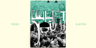
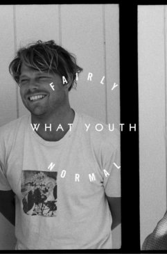
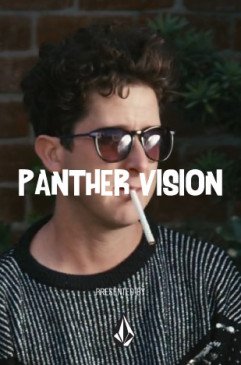
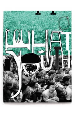
For the rest of the interview and an original David Carson cover, be sure to pick up a copy of What Youth Issue 11 here.