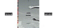
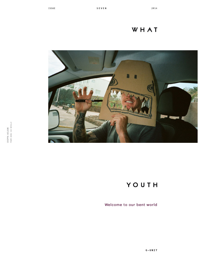
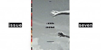
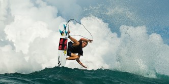
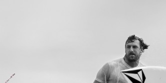
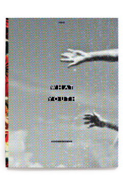
A lot of people have been asking about this month’s cover. Like, umm, “What the fuck?” So we thought it’d be cool to explain the process that got us there. Art director Scott Chenoweth had a vision — and while it didn’t show itself right away and caused him to become his local liquor man’s best friend — we thought it’d be cool to hear from him on what it took to illustrate that vision, which is Mitch Coleborn, shot by Nate Lawrence. But it’s also so much more than that.
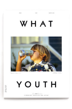
Scott Chenoweth: “Since What Youth’s first issue we’ve had a pretty cohesive look on our covers. A centered portrait, split logo, and the same cover blurb lock up on each issue. The Cristian Fletcher issue (What Youth Issue 6) was our first slight departure from this. Since What Youth’s birth, we set out to make books — individual pieces — all unique from their counterparts. And as we neared the deadline of Issue 7, we concluded that we were starting to look formulaic.
Getting down to our Friday deadline, we still didn’t have what we wanted. Sure, we had plenty of beautiful imagery, but nothing that said this is new and different and not like anything you’ve ever seen before. So we handed the entire issue to the printer, minus the cover. We convinced the printer we needed the weekend to work on the cover and he’d have it by Monday. Ha! Anyway, I set off on Friday afternoon with a quick run through the liquor store and told the boys I would not appear until I had the next cover. So I locked myself in my apartment for the weekend and lost my mind on several occasions. The result of my weekend was about 320 different cover options. I came in Monday morning and showed the crew: as luck would have it, nothing worked. With the impending deadline and a printer who was calling me every hour saying they are on press and need the cover to run in the first fold, my Monday was hectic. We scrapped everything I did that weekend and started over. I nearly lost it, slept, and then I came in Tuesday morning without looking at anything all night and sat down and knocked out one last attempt in about 20 minutes. That final attempt is the cover you see now.
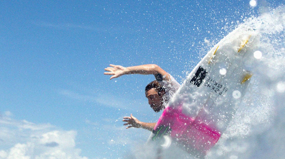
It took countless hours and over 300+ mock ups to sit down and do the final cover in 20 minutes. It’s Mitch Coleborn’s hands from a cropped water shot by Nate Lawrence. I used a color half tone pattern on the black and white image for two reasons. One being that I love the fact that a black and white image can be made up entirely of small colored dots and you can only see this when you’re holding it up close. And two, blowing up the halftone dot pattern is an emphasis on the process of print. Which we archaically still dig. I wanted to play up that fact by showing the actual print process of all images. So we put it on our cover, in your face. This is a book. It looks different that the other books we have made.
This cover’s biggest success was the fact that it broke our mold. No longer are we tied to centered portraits. No longer must we put the logo at the top and the bottom of the page. It opened us up to do exactly what we set out to do: make something truly unique every time we put out an issue. Now no one knows what to expect on the next cover. And neither do we.”
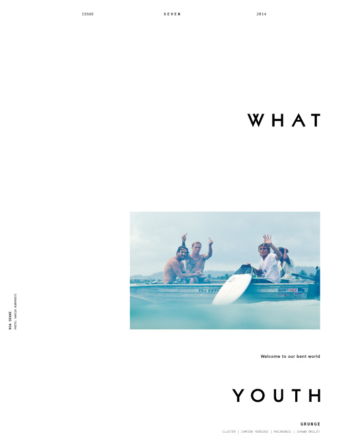
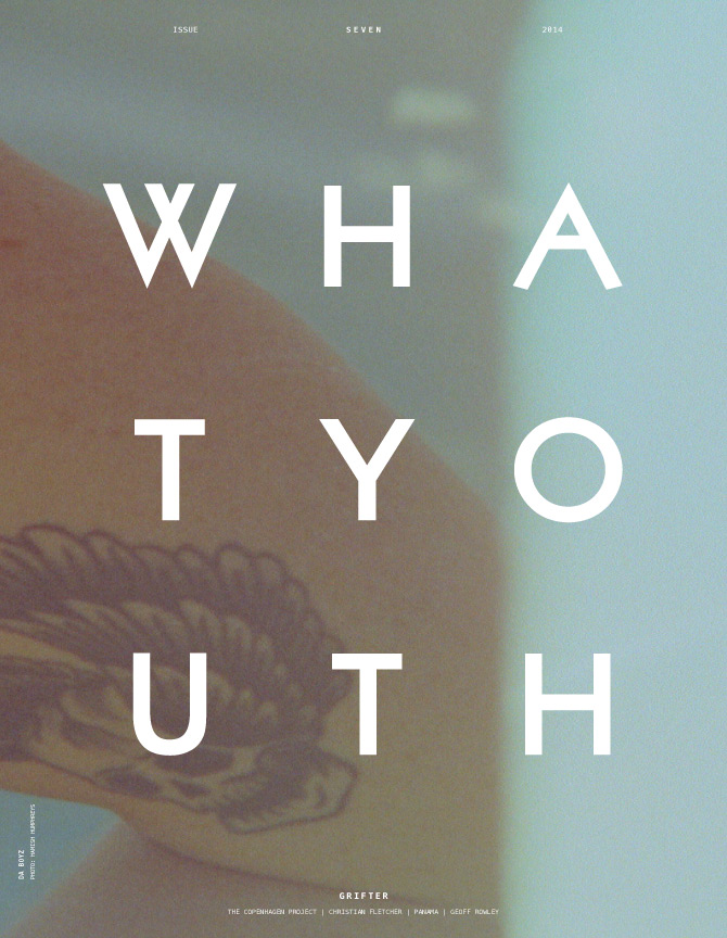
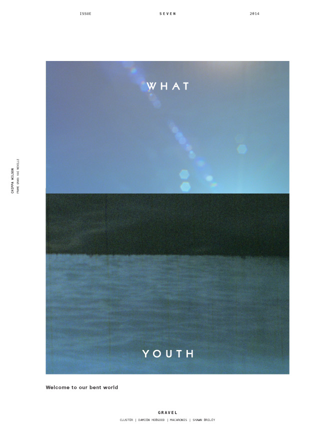
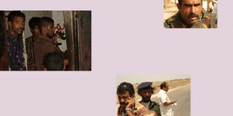
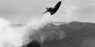
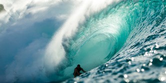
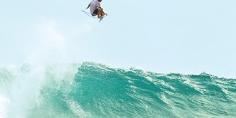
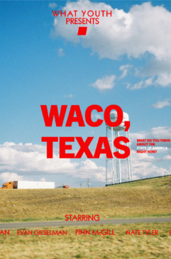
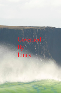
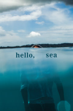
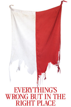
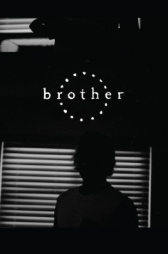
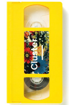
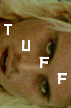
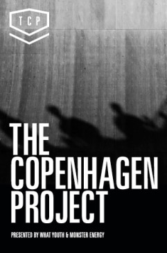
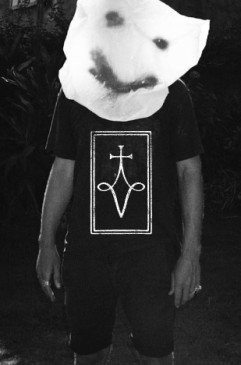
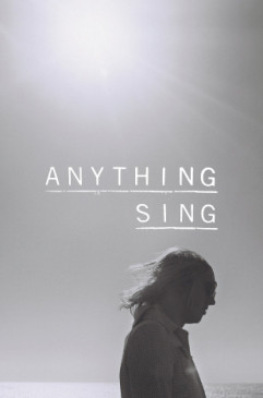
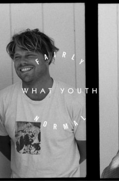
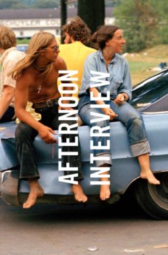
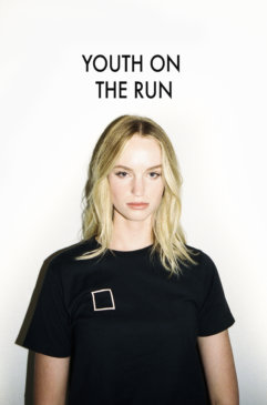
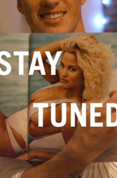
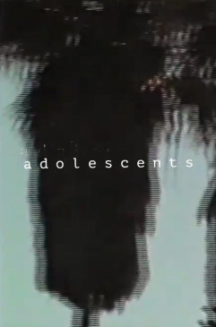
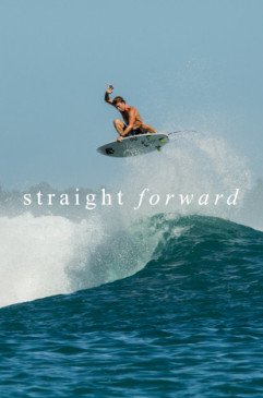
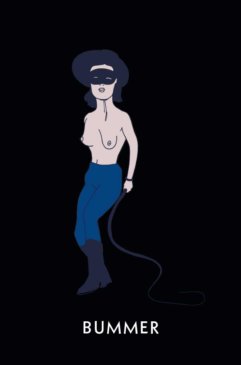
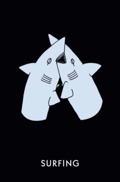
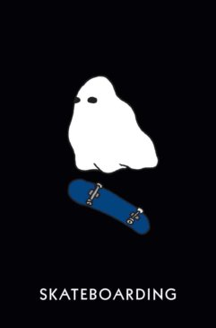
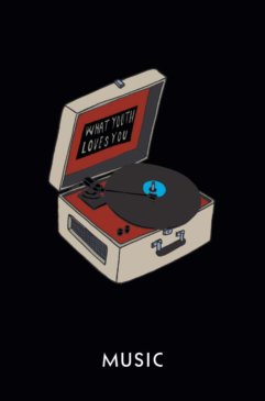
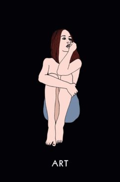
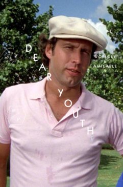
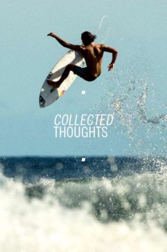
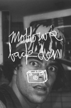
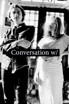
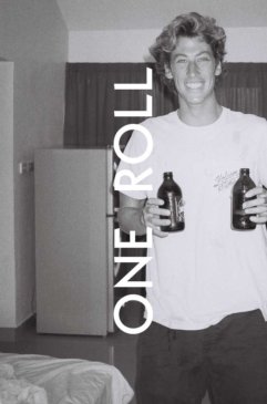
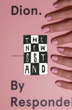
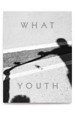
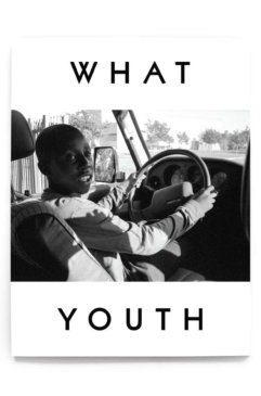
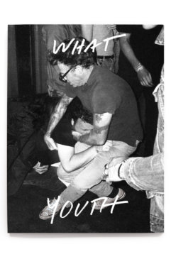
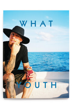
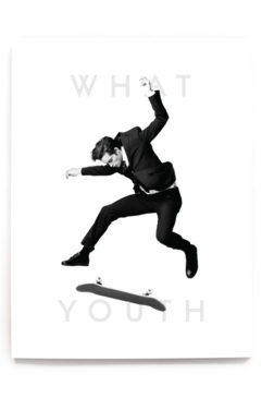
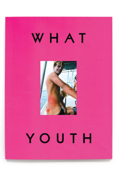
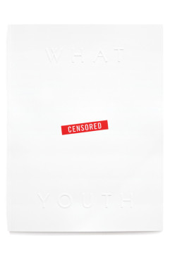
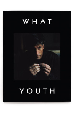
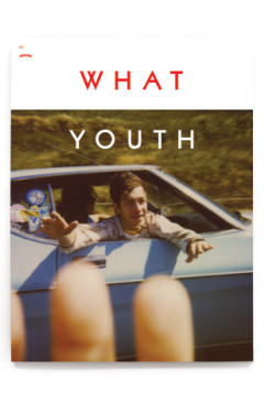
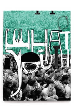
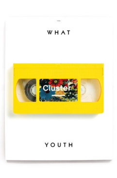
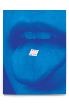
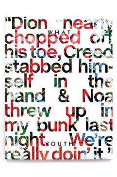
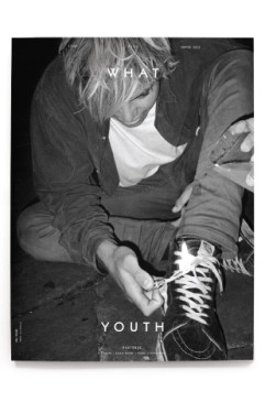
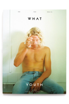
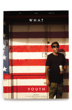
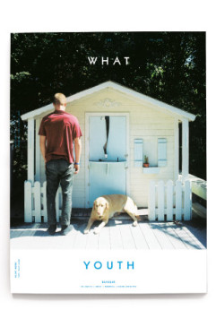
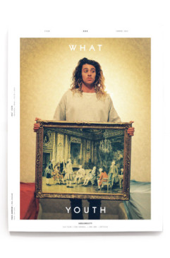
Below are a couple of the mock ups that were shot down in the process.













 NXT
NXT 

